Art & Music

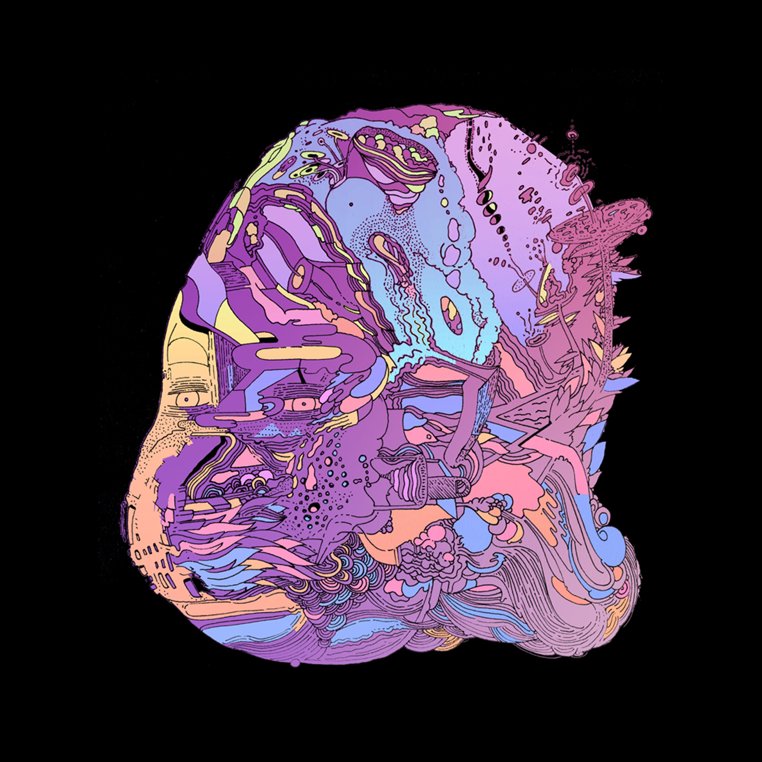
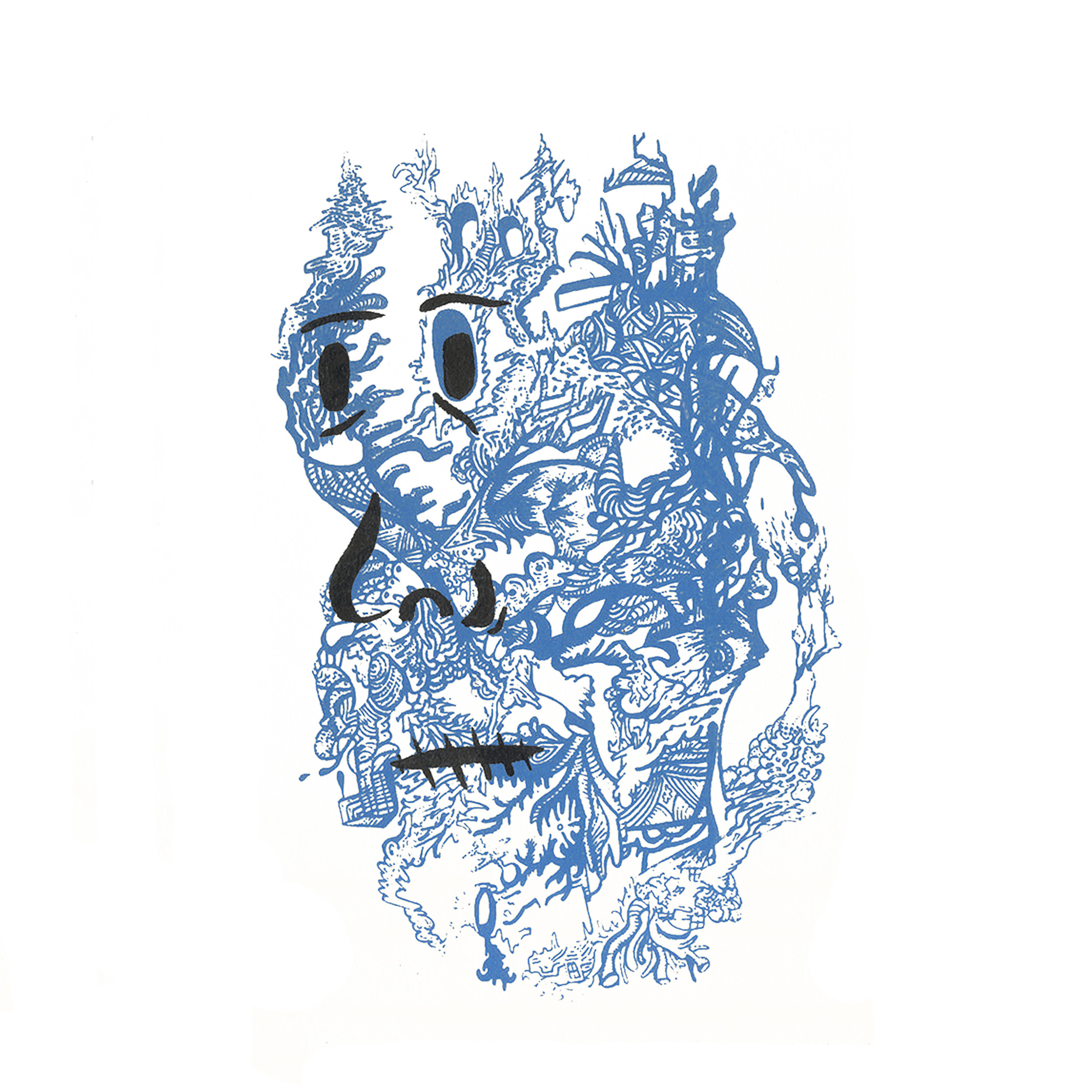
Music has always been present in my life. As a youth my dad would play music constantly, any car ride was accompanied by a tape from a vast collection. Home brewed mixes crafted by him and his friends with intricately drawn psychedelic spine drawings. He would be Consistently playing everything from blues and jazz classics to early punk, hip-hop, and everything in between on the car rides to school. At 17 I started working at the local record store and proceeded to burn though a significant chunk of my earnings purchasing vinyl. In the shop we would poster all the walls, some having 10-20 layers of promo posters, naturally creatively inclined employees utilized these as drawing surfaces. Working in that shop was where I realized that combining art and music was something I definitely wanted to be doing.

This previous post discusses the process for an experimental music video constructed shortly after my move to LA. Since that release I’ve been able to create some animated videos. The band On Drugs approached me to make a music video for their single Scaredy Cat. There was no prompt and a quick turnaround. The result a trippy fever dream done frame by frame in Animate.


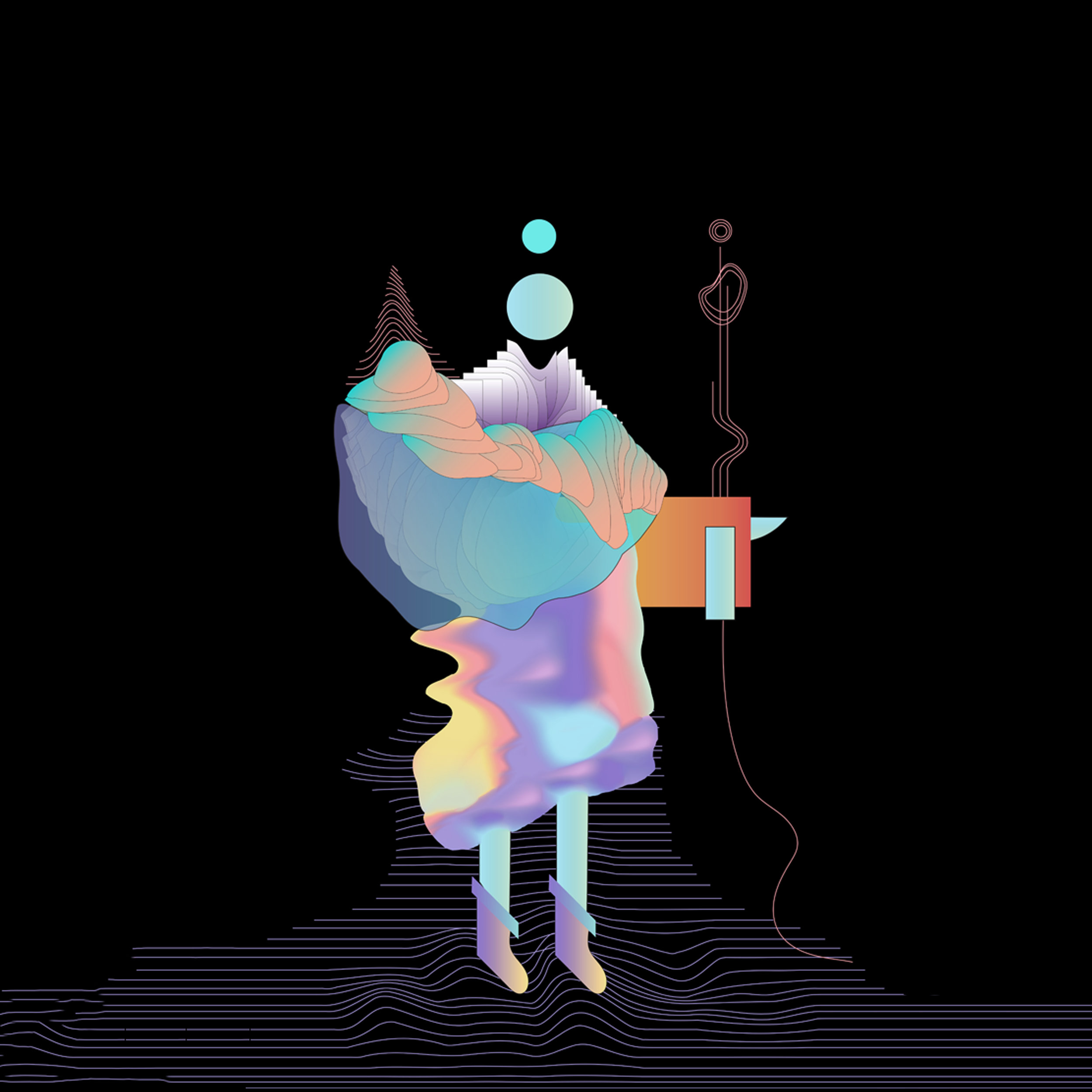
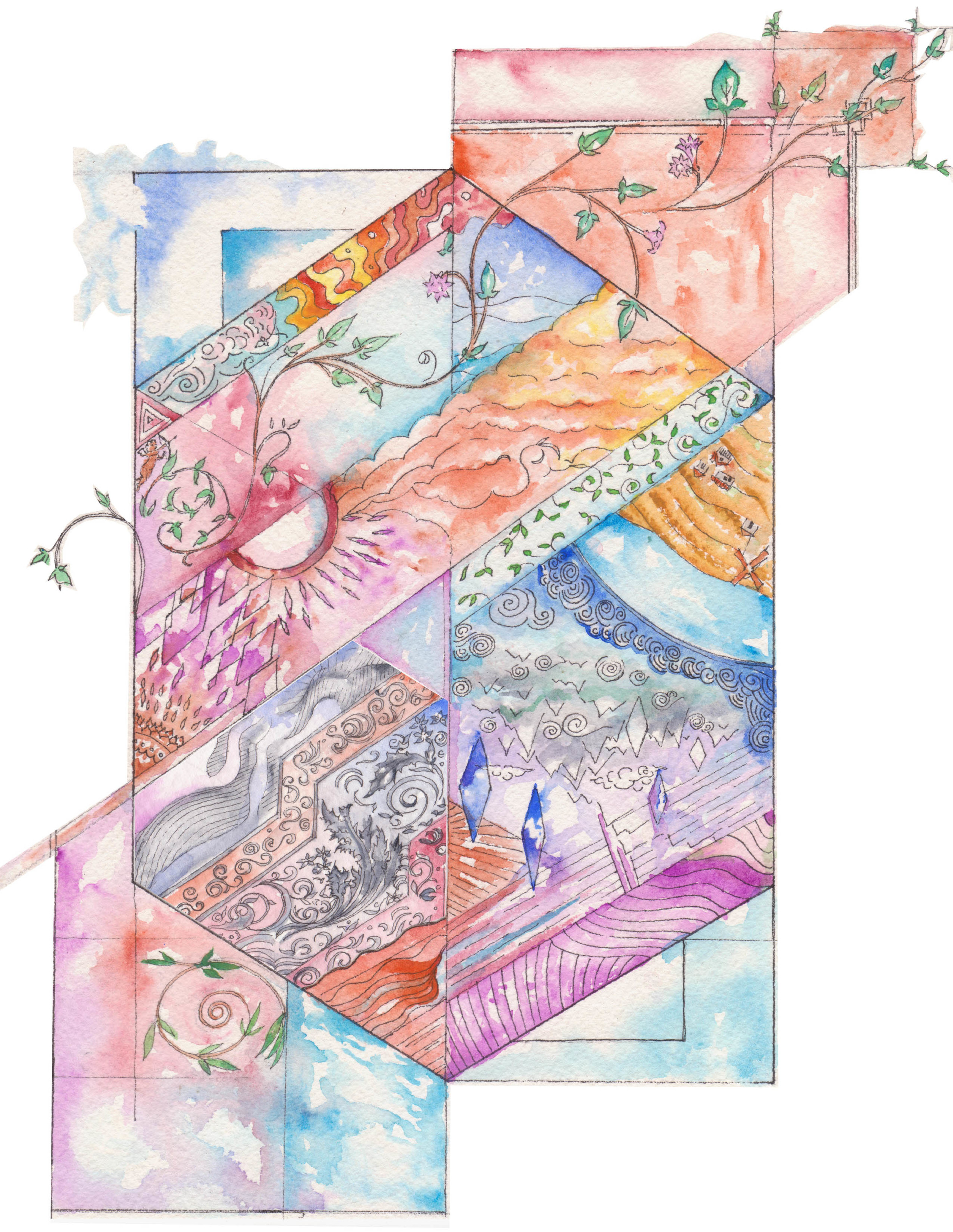
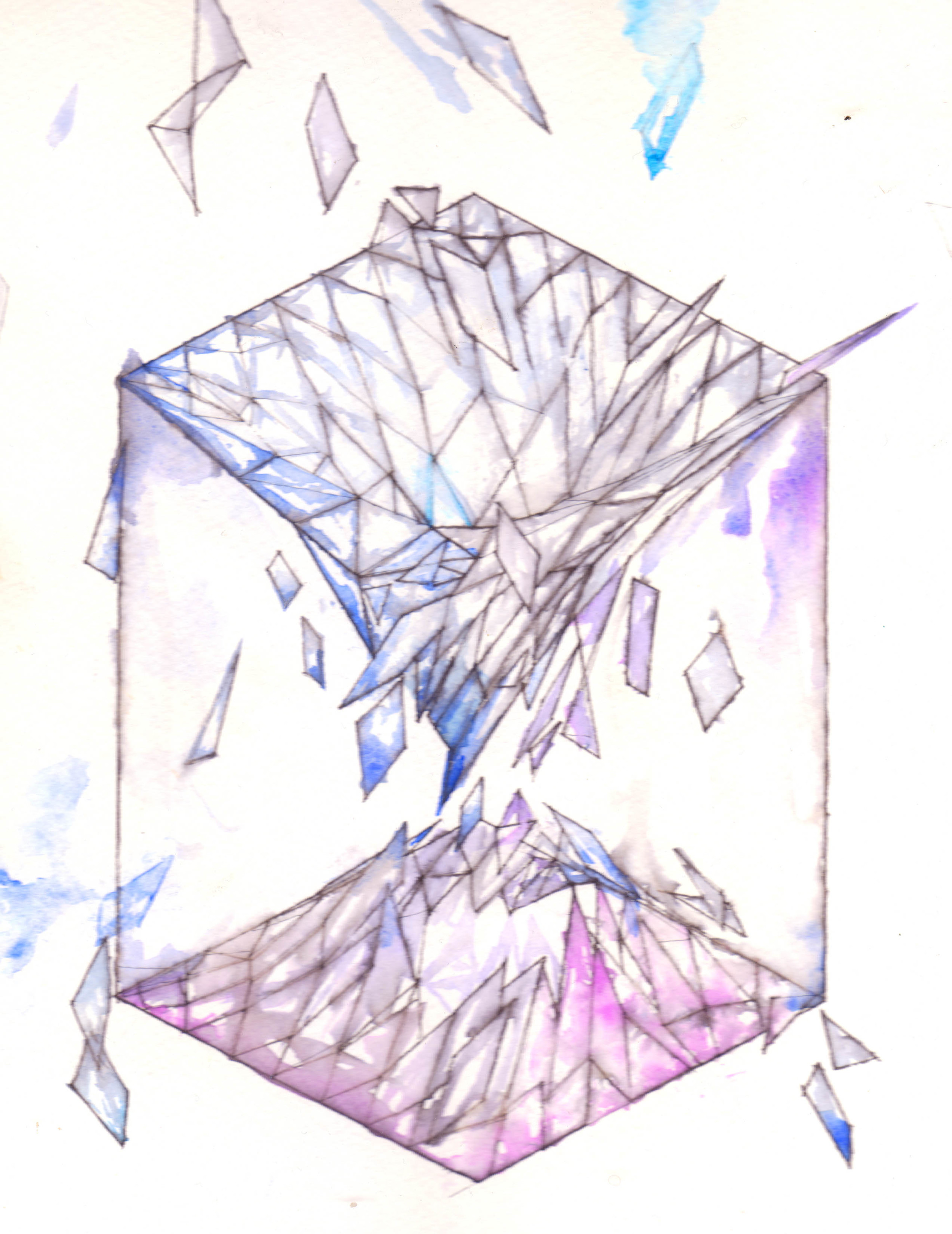
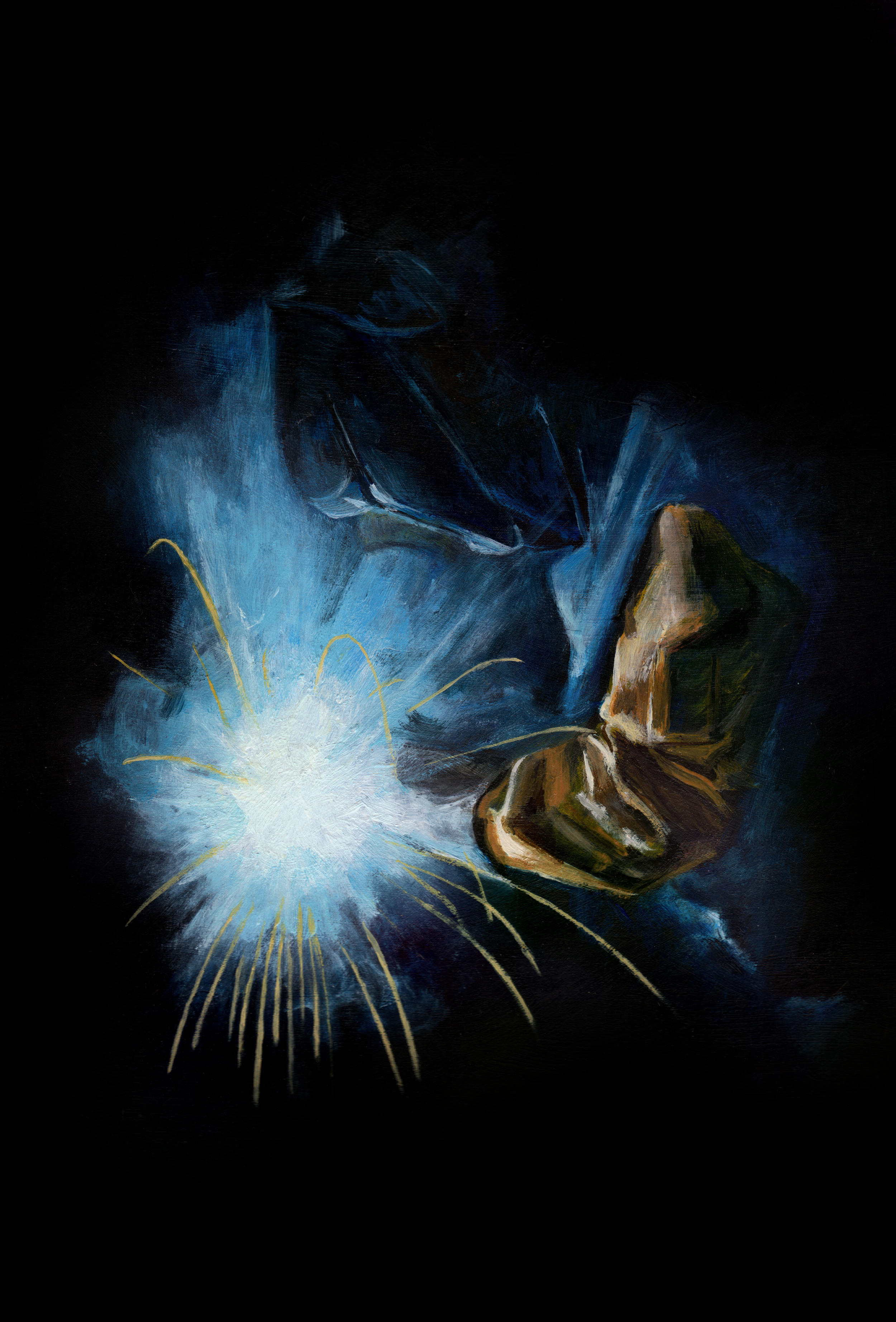
Shortly after that was complete my friends Burton and Ben were gearing up to put out their first record on new label the periphery. They asked me to create full length visuals for each track of their flagship release “Sounds From the Periphery”. This was a wonderful experience which allowed me to play around further with this idea of combining loops and morphing things over time to accent the music. Below is an example showing some snippets of each visual collaged together. The full playlist can be viewed here.


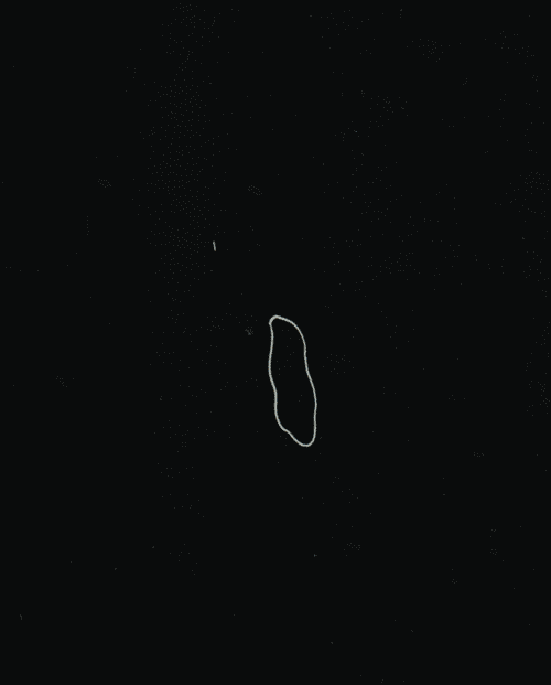
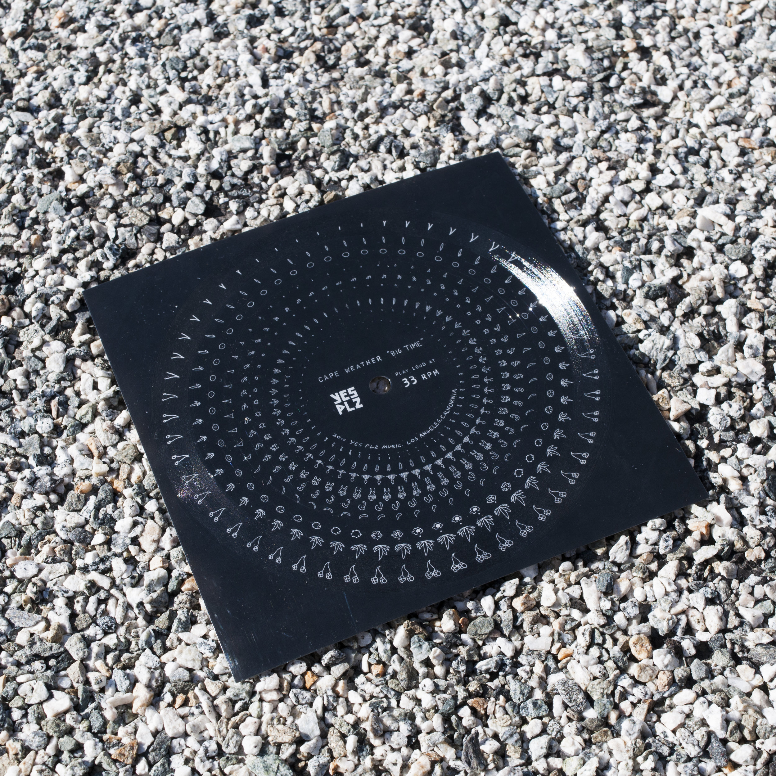
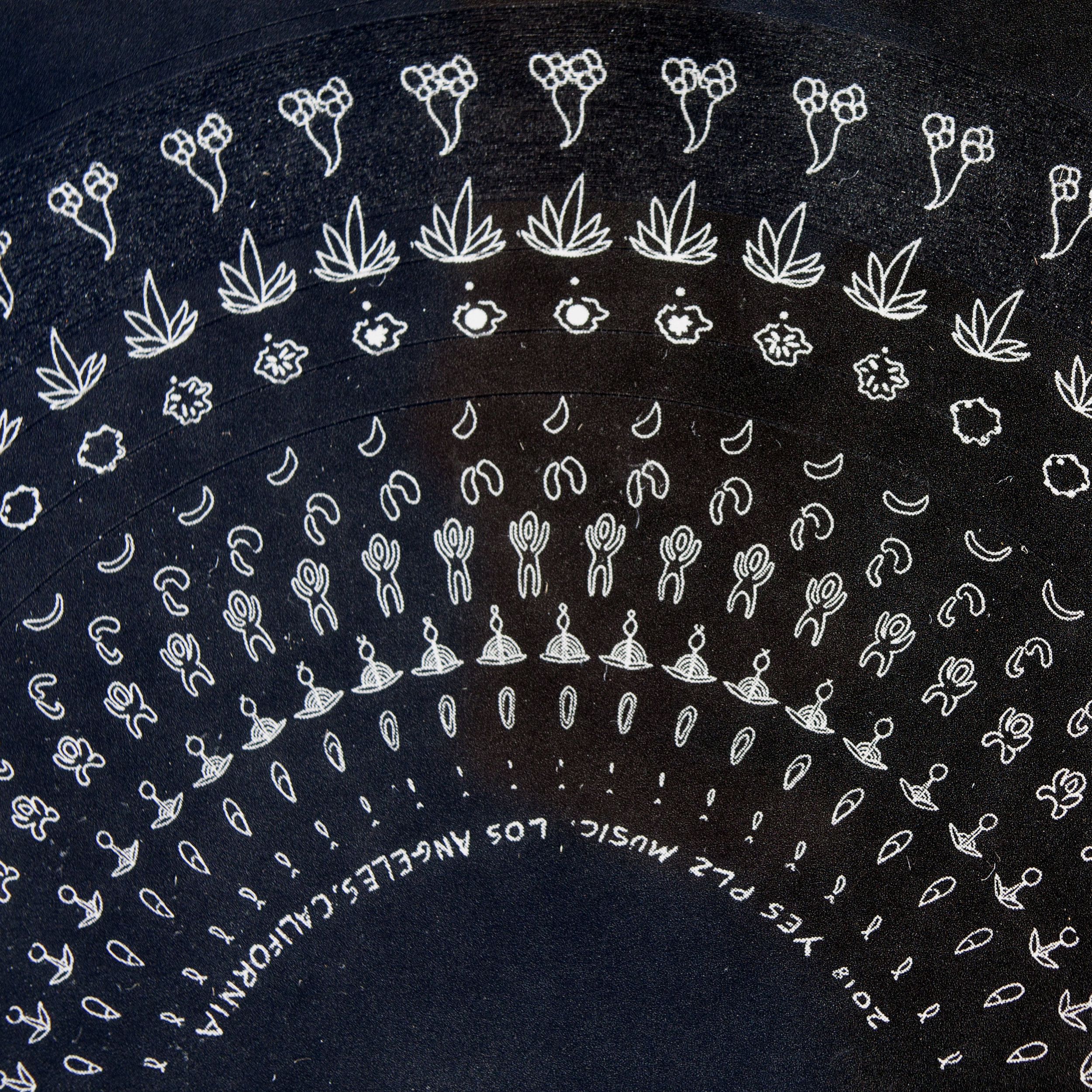
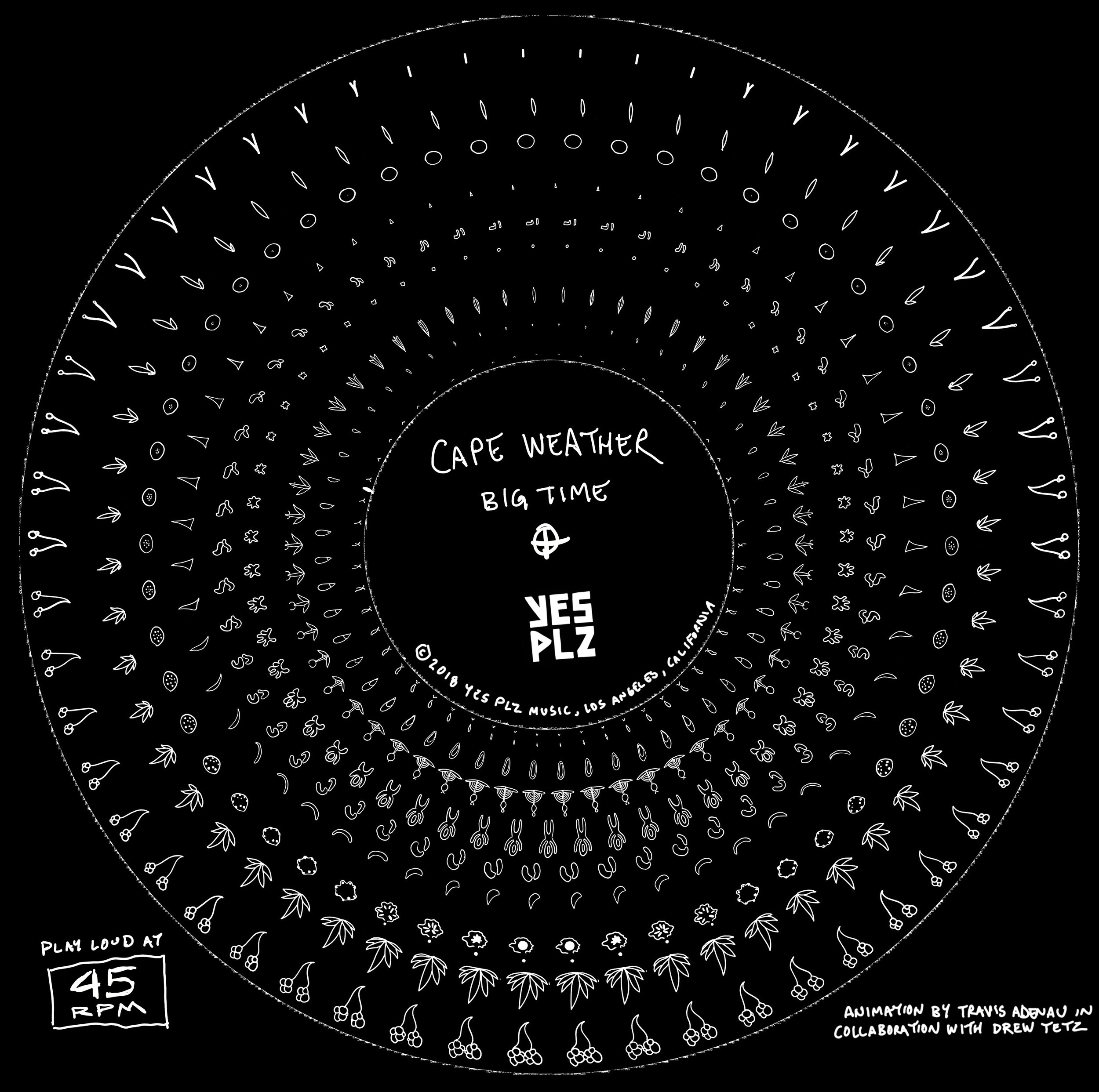
At this point I had done a number of smaller animations and projects with the Future Gods label. The first physical project released is a phenakistoscope, a pre-cinema animation technique which used a disc which created the illusion of motion when viewed through a spinning frame. Animation wizard Drew Tetz has been learning how to apply this technique to vinly records with some really stunning results. He broke down the process and I created a set of animated loops to accompany single “Big Time” by Cape Weather.


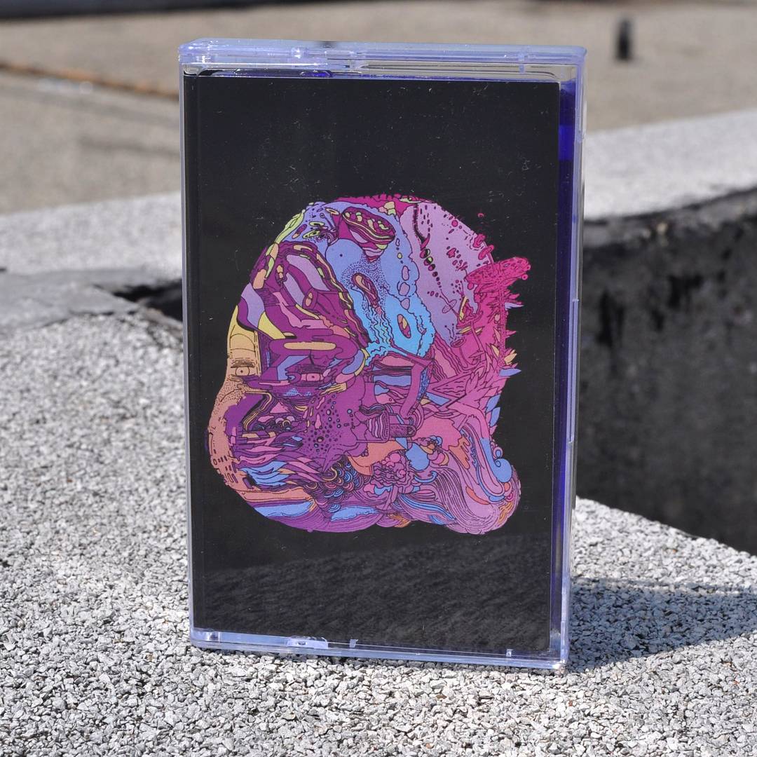
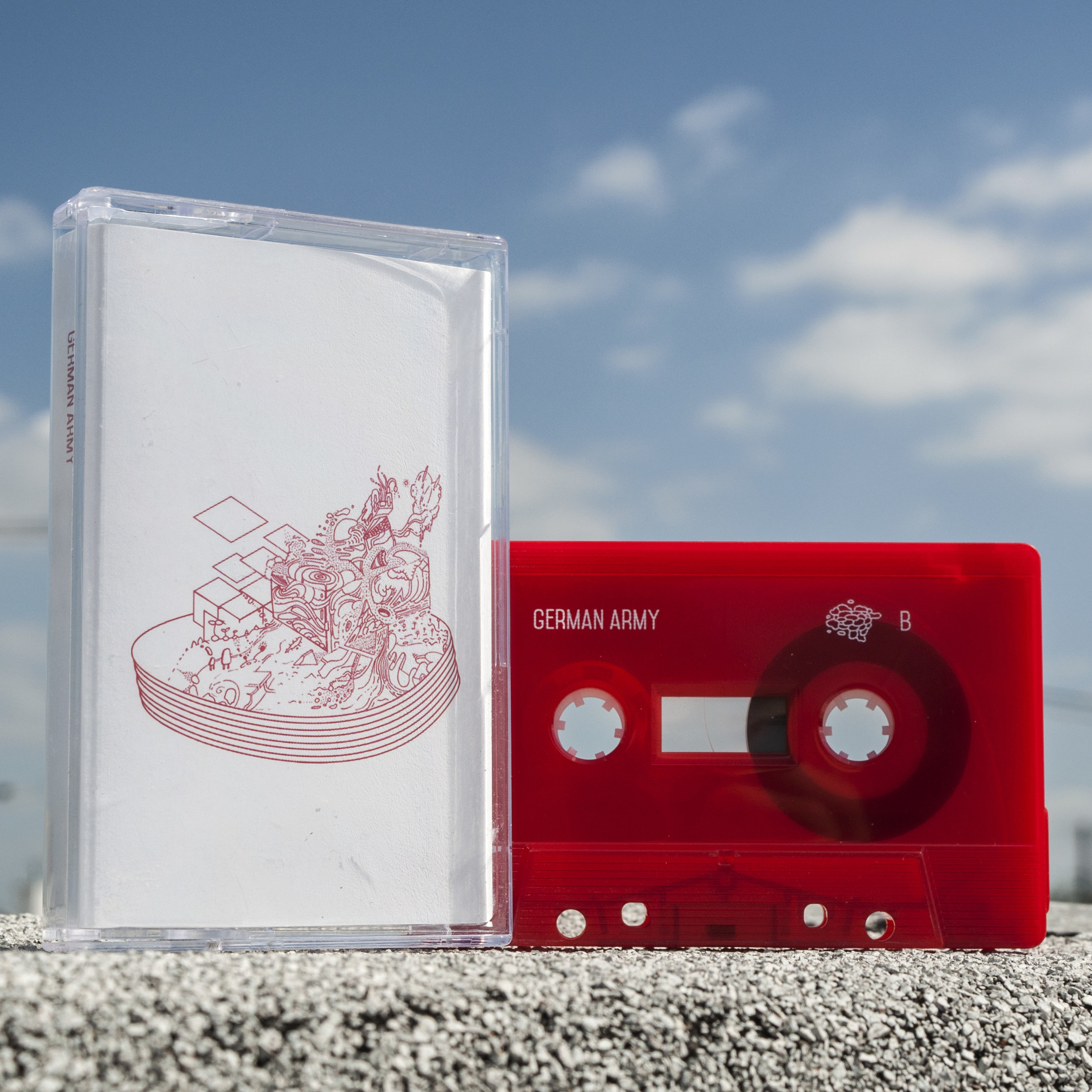
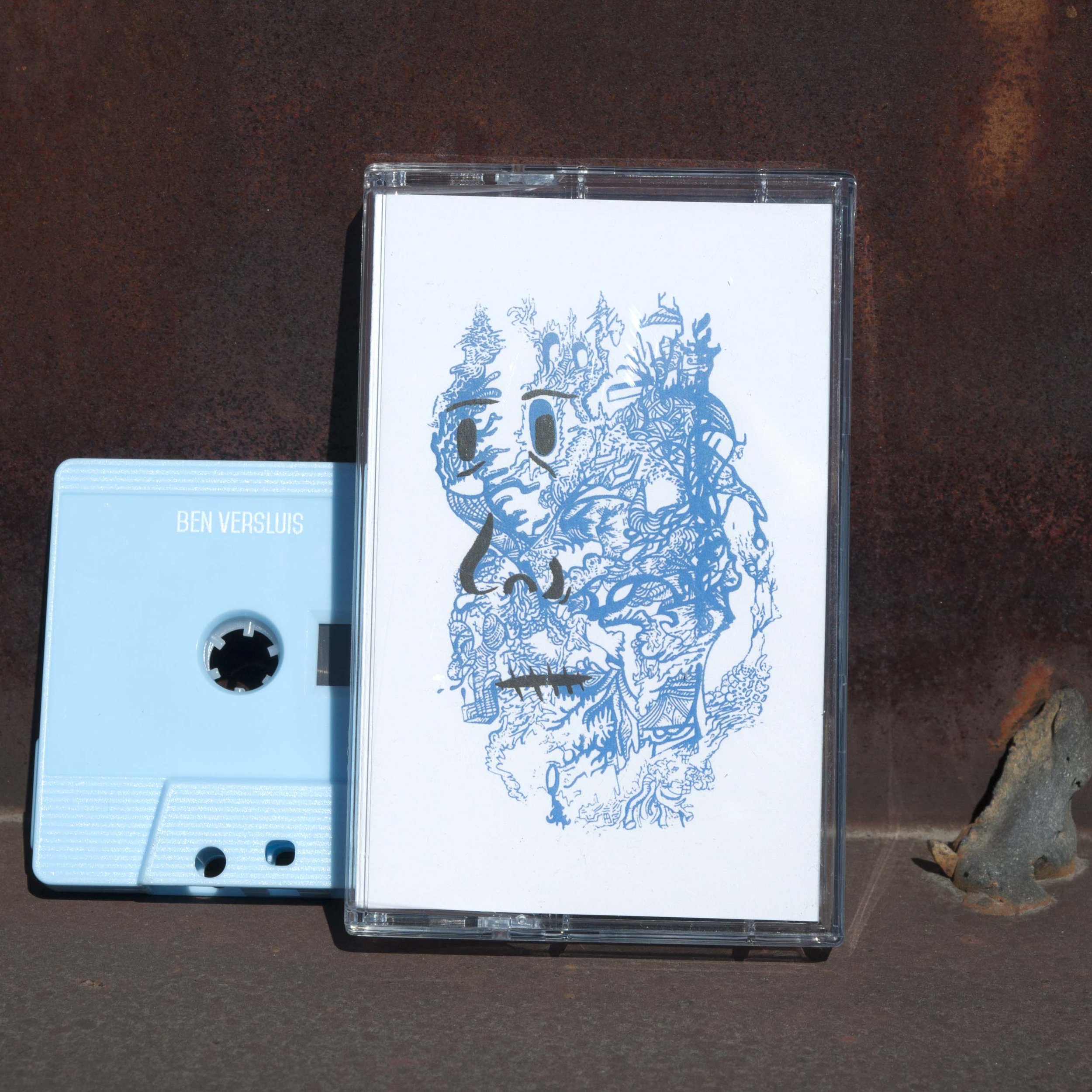
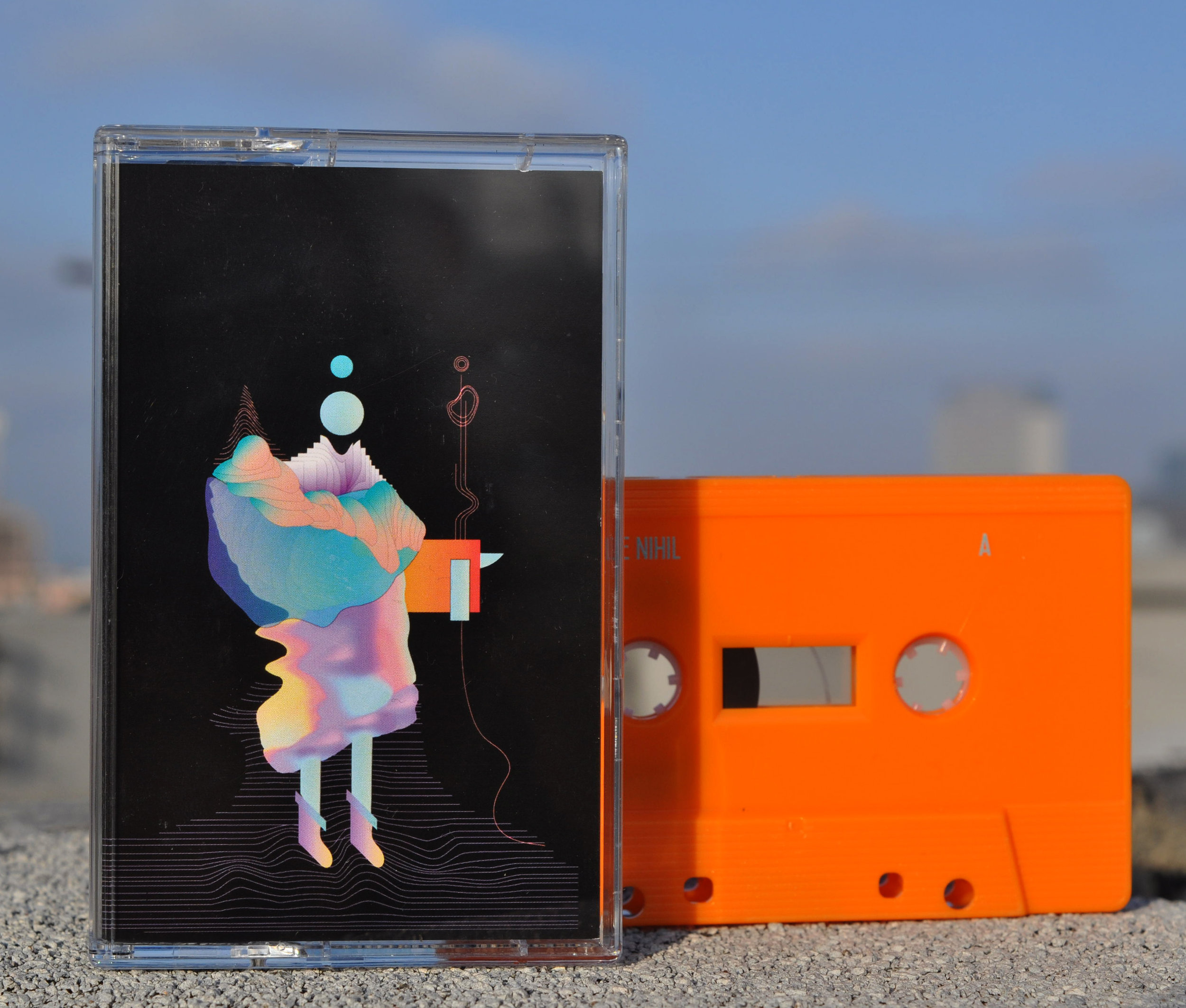
Another physical release that was created in collaboration with Seagrave records is this series of cassette tape designs. It’s wild to think that my dad was making mixes on this format as a young adult and passing them down and now I’ve had some part in keeping this thing alive in the universe. These have all been incredible projects to take part in and I look forward to where things will go next.

Why We Do It:

In a world where Amazon can co-opt your business model overnight, and it seems there are 50 competitors moving in on every angle, what is the rhyme and reason behind starting our own small design & printing company? We built Overcast because we realized that even if there are 100 companies who all claim to do the same thing better than the next, we can still be different, and we can still be better - not just for ourselves, but for the art, the artist, the customer, and ourselves.

Even in the phygital age, where an idea can be born from brain to pixel to page in minutes, there is a still a huge and growing place for personal and crafted service. While some websites fit the artists into a box and make them conform to a business model, we try and run things differently. We work diligently to make sure that our artists aren’t limited by our processes, but rather allowed to explore the processes themselves, to find what works for them and how our collaboration expands their art to its full potential, while bringing it to life as a marketable product.

When we see art that speaks to us, we reach out personally and if the creator is interested in collaborating, we work with them hand in hand to produce a deliverable that is worth the time and effort. Sometimes it can be as simple as choosing the right medium, other times it can be more challenging. If an artist is not comfortable or able to work with digital processes, we work with them step by step to convert their physical product to a digital or screen print in a way where the artist knows what and why we are doing, and we allow and encourage their input to the process, so that they not only understand where we are coming from, but they also see where they can be going with their designs.

This means if someone is not comfortable or knowledgeable about the ins and outs of production - for example if we are converting an artist’s photograph into a screen print, (which to the uninitiated can be a very mysterious process.) We walk them through it step by step until they see how the physical realities of the process impact the design, and we allow them to change or tweak things to make a reliable product which meets the aesthetic and economic needs of each artist - with our help of course!

We don’t hold artists and creators to price points, we don’t keep them limited to a certain size. If it can be done, we work with our artists to find a way to make it happen. If an artist chooses to change their design to make a product more in line with what consumers want, that’s what we do. If they want to buy from us wholesale and sell themselves, then we work to make that happen. If they want nothing to do with production, then we are happy to take the helm.

From one of a kind, to editioned designs, on up to mass production making as many for as little cost as possible, we work to do it - even if it means a smaller bottom line this quarter or next, because ultimately, creators, producers, and consumers want authenticity and integrity, even if it’s on a t-shirt.

Building Something out of Nothing

An exploration in hand drawn animation

Frame 24

Frame 24

Frame 48

Frame 48

I was in an old antique shop on Burnett ave. in Syracuse, NY when I saw a great looking light table and decided to buy it.  From there I began creating simple animations on paper, these would frequently start as a single point, meaning the first frame would be a very small dot or line segment, and from there each frame drawn would be a progression from that original point. It was a very organic process because I was always reacting to the frame I had drawn previous just propelling these shapes forward but with no real destination in mind.  After spending a lot of time animating within a computer program there was something especially liberating about letting it go on paper, building something out of nothing, one frame at a time. I started doing 24 frame segments which would equal one second of fluid animation. Scan in the sheets of paper (at 300 dpi), bring the files into After Effects, and render out the video. This moment when you see the drawings come to life and start moving is just wonderful, it is a lot of effort to make static images dance but I really enjoyed the process, there was a sense of meditation in the repetition.  I started to increase the length going up to 48 frames, taking time to play more with post processing and manipulation.


First experiment with the light table, 24 frame animated loop.

First experiment with the light table, 24 frame animated loop.

First test with 48 frames

First test with 48 frames


Eventually I decided these loops should become part of a greater project. I began by removing the background paper texture which left me with just the line work against a transparent background.  This enabled the ability to stack loops directly on top of each other where the lines can kind of weave together. This opened up another world, where one loop of animation ended another could take off creating more of a flow with a consistent background. From here I just kind of built a scene outwards throwing all the loops together in an almost circular array and having the camera pan over this landscape of loops all undulating and flowing into each other, it felt good to kind of unify all these little experiments.

As I was editing the video taking a break I saw my friend Aaron had released some new music with his friend. I'd really enjoyed hearing him play live in the past so I threw it on and continued editing and ended up listening to the 25 minute piece a few times consecutively.  The pacing but mostly the mood of the audio seemed to line up well with the video and so I threw the track over the video and it just felt right. I sent it over to Aaron @theinsistentself and his musical collaborator Derek Housh @feelbadbeats and they both loved it.  It was kindly featured on the DEEP Vimeo channel and at Memory.is, a great place to kill some time and see some weird videos. Just make sure you watch in HD at least 720, 1080 for the true heads.


Should really be viewed in 720 or 1080. Music by aaron wing derek housh https://feelbadbeats.bandcamp.com/album/weed-ca-pay-me


Values: Community Support

One of our core values as a company is contributing to our local community. This means a commitment to being actively engaged in supporting neighborhood development and community assistance. Our desire to improve our community stems from a belief that a business should be run by the workers and for the interests of the workers and the broader community that we serve . Our local activism should grow as we develop as a company, supporting community institutions through financial contributions, business partnerships, artistic collaborations, and donations of labor and material.

This summer we took our first steps in recognizing our goal through our partnership with Students of Sustainability, a Syracuse University based environmental group seeking to increase sustainability and environmental consciousness across campus. We donated 10% of our sales at their annual Earthfest to the organization Syracuse Grows. Syracuse grows is a group of gardeners and urban agriculturalists establishing community gardens around the city to help increase access to fresh seasonal foods and revitalize our urban landscape.

Students and locals gather at the Thornden park amphitheater to enjoy Earthfest 2016 

Students and locals gather at the Thornden park amphitheater to enjoy Earthfest 2016 

We were also fortunate to be able to work with the CNY Pride Parade, providing shirts to the group with donated labor. Celebrating Syracuse's LGBTQ community was amazing, and the outpouring of solidarity was more important than ever this year.

Marching from Solar St. the the Inner Harbor. Photo credit to Michael Greenlar of the Post-Standard.

Marching from Solar St. the the Inner Harbor. Photo credit to Michael Greenlar of the Post-Standard.

We our proud to support such important projects and organizations, but our efforts wont stop here. We will constantly be working to find new opportunities to realize social and environmental justice and improve our surroundings. If you represent a local group looking for donated printed goods or even just in need of a few volunteers be sure to contact us through our website. We hope to keep you posted with more news, but until then peace and solidarity friends.

Pattern-Post 2

What is the meaning of hand drawing today, particularly when many of the things drawn, are inspired by digital creation? What does the way we do something say about the end result? Is it meaningful to make analog representations of digital creations and generations?

In thinking about these kind of techno-artistic issues, I think it is paramount to not only look at where we are, but also at precedent. While we struggle to find meaning with our makings, it is important to consider that this is not the first time that this kind of issue has come to the fore and most certainly will not be the last. 

As the use of technology changes the meaning of our work, I am always reminded of John Ruskin. Though I certainly cant agree with all of his motivations or conclusions, Ruskin's methods and results produced some truly timeless studies and insights. This is perhaps, my favorite diagram, illustrating the commonalities of natural form, between mountain and branch, wave and shell. At the same time, his world was being transformed by industrialization, and the meaning of art was being challenged by mass reproduction and mechanization, and it became increasingly difficult to find meaning in producing by hand when the results of machinery can be infinite and infinitely precise.

"'Abstract Lines.' John Ruskin. 1856 or 1857. This drawing served as an illustration to Volume l of The Stones of Venice (1851) to demonstrate that architectural ornament should be based on the abstract lines derived from natural shapes, a-b: t…

"'Abstract Lines.' John Ruskin. 1856 or 1857. This drawing served as an illustration to Volume l of The Stones of Venice (1851) to demonstrate that architectural ornament should be based on the abstract lines derived from natural shapes, a-b: the curve of glacier near Chamonix; d-c, e-g, i-k: curves in mountain ranges; h: a branch of spruce fir; 1-m, q-r, s-t, u-w: leaf shapes; n-o: the lip of a snail shell; p: a worm spiral. See 9.266-9."

In the spirit of Ruskin's diagram and theory of natural abstraction as the basis of ornamental beauty, and beauty as an objective quality derived there-of, I decided to follow his strategy of using abstractions to represent naturalism, while at the same drawing from the concept of the grid and weaving, as weaving and textiles were the foundation of the industrial economy and the transformations that influenced Ruskin's work. 

2016 Event Calendar

Hey folks, just wanted to let you know where you can find us this spring and summer at events in Syracuse. We always have a great time at these events so come check them out.
 

Like us on Facebook and Twitter to get all the updates about upcoming events.


Pattern-Post

            Pattern making to me is the confluence of design and technology in architecture. Where human intent and computational logic, at times can meet on a level playing field of desired affect and systematic process. This is in some sense I think, the struggle of architecture today, as we struggle to find purpose behind the might of the machine, and put meaning to its makings. but pattern is also the place in which other fields of art, craft, and design are most easily able to flow in and out of the phygital environment in which all art and design increasingly finds itself. 

Glass 3D Printing (G3DP) Additive Manufacturing of Optically Transparent Glass developed by the Mediated Matter Group at the MIT Media Lab in collaboration with the Glass Lab at MIT. Ancient yet modern, enclosing yet invisible, glass was first created in Mesopotamia and Ancient Egypt 4,500 years ago. Precise recipes for its production - the chemistry and techniques - often remain closely guarded secrets. Glass can be molded, formed, blown, plated or sintered; its formal qualities are closely tied to techniques used for its formation. From the discovery of core-forming process for bead-making in ancient Egypt, through the invention of the metal blow pipe during Roman times, to the modern industrial Pilkington process for making large-scale flat glass; each new breakthrough in glass technology occurred as a result of prolonged experimentation and ingenuity, and has given rise to a new universe of possibilities for uses of the material. This show unveils a first of its kind optically transparent glass printing process called G3DP. G3DP is an additive manufacturing platform designed to print optically transparent glass. The tunability enabled by geometrical and optical variation driven by form, transparency and color variation can drive; limit or control light transmission, reflection and refraction, and therefore carries significant implications for all things glass. The platform is based on a dual heated chamber concept. The upper chamber acts as a Kiln Cartridge while the lower chamber serves to anneal the structures. The Kiln Cartridge operates at approximately 1900°F and can contain sufficient material to build a single architectural component. The molten material gets funneled through an alumina-zircon-silica nozzle. The project synthesizes modern technologies, with age-old established glass tools and technologies producing novel glass structures with numerous potential applications. The G3DP project was created in collaboration between the Mediated Matter group at the MIT Media Lab, the Mechanical Engineering Department, the MIT Glass Lab and Wyss Institute. Researchers include John Klein, Michael Stern, Markus Kayser, Chikara Inamura, Giorgia Franchin, Shreya Dave, James Weaver, Peter Houk and Prof. Neri Oxman.

With the increasingly sophisticated tools available to everyone, from parametric generators like Grasshopper and Cinema 4d, systematics like Revit, and the ubiquitous adobe suite, all of which in their own way encourage defined process, repetition, and parametric process, and at the same time, in their own ways facilitate manufacturing.  A favorite project of mine, and example of this process is the John Lewis department store in Leicester, designed by the late great FOA (Foreign Office Architects.) 

aiu_foa_john_lewis_006.jpg


While the processes employed in achieving the exterior effect are relatively simple, a system of identical connective points on all four sides of the tile unit, allow any design which can terminate at these points to be used to connect to the next unit, allowing for both repetition, simple manipulation ala rotatoin, as well as difference , provided it follows rules.

Not only this but the design of the pattern itself is taken from the archives of the company, which along with the city of Leicester possess a great history textile design. This kind of intimacy of design allows parameters and process to be made recognizable and, potentially interactive and didactic, and more so, I think it simply puts more meaning in the message, allowing the influences of the design to suffuse the process, rather than being simply overwhelmed by computational attributes.


Frequently, parametricism leads to undeniably sterile results which all too frequently emerge, either through varying digital, 

Zaha Hadid Architects - Istanbul Masterplan

Zaha Hadid Architects - Istanbul Masterplan


or anaglog processes.


I think this is because the driving forces of the design, ultimately are not really informed by context or even really articulated at all, but because of our inability to deal with the excess of datas presented to us, process overwhelms both capability and intent. This I think is frequently the root cause of design which can only be described by its method of production.


This is not to discount the inherent richness of exploration in new processes, as well as the influence of brute procedural logic cannot be employed to produce novel and sublime aesthetics, but even at what has been its apex, I think these processes alone produce work which is undeniably alien.


I think design which emphatically puts context and narrative into form and process , while employing the power of computational exploration, will be the potential of parametrics in the future.


I will be starting a series of pattern-making which will attempt to employ both defined process and computational logic, being open to all sources and methods, but attempting, with the definition of procedures, to employ real meaning into its manifesto.


              Starting with a simple grid system, and sketching patterns which only qualify for the simplest conditions imaginable, I want to build up a series of increasing complexity and iterative refinement which take both technical procedural-ism and narrative pattern-making, in tandem. This series of sketches rests on the same premise as the John Lewis Facade, and also begins to explore the idea of specialized modules within that system, making particular pieces which only interact in particular conditions, and the changing of narrative, to begin to allow for ecosystems to evolve within the process.


By defining connective members, panels can be assigned simple parameters which can be used to carry over into other squares.

This will be the start of the pattern-post series, which will be a weekly addition to the overcast design blog, featuring both an article of interest, be it new or historical, and an iteration in what will hopefully be increasingly content driven, parametrically defined, patterns.

100 Cups

by Jim Boettger

Back in 2012, M.E.S. and I decided to start saving our Red Stripe and Rolling Rock bottles to make glasses out of them. Making cups from soda-lime glass bottles was nothing new to me. I was a recent graduate of Alfred University where I studied glassblowing and I had seen many experiments involving similar setups.

We began collecting bottles that interested us. One thing that we look for is bottles with screen-printed enamel paint. Unlike a paper label, the enamel can withstand the heat of the kiln and ends up on the finished glass. I bought a small glass kiln, a bernzomatic map torch, and we were ready to start making glasses.

Travis Adenau, another co-founder of Overcast Design LLC got us in touch with The Mission Restaurant who was interested in using our glasses in their restaurant. Using their bottles we cut, fire polish them and return them. 

mission cups.jpg

Designing With an Umbrella.

In starting an art company, there are competing interests.

On the one hand, as an artist run company, we are all invested in producing the highest quality work. Personally we hope to always be striving for both technical virtuosity, as well as conceptual,  engaging content. On the other hand as a company, we are working towards building a recognizable identity as a branded product, and common wisdom often says this might demand things that are sometimes obstructive to ideal artistic practice. 

As a continuing exercise in both artistic creating and in commercial production, we have started a series of designs which focus on our logo as the base. While plenty of brands work with their logo as a design object, one need only think of Louis Vuitton, Dolce Gabbana,  or any other serial monogrammers to spot this trend in high fashion, to say nothing of other more everyday examples like Nike or or Victoria's Secret PINK line of clothing.

What we are attempting to do with this line of design is to work within this icon we have created to develop a brand, but to not let that symbol dictate our means, outlook, or product. We can break down its definitions and boundaries by employing different artist's ideas, iterating themes, changing materials of both design and production. The works we've made so far will be just a start, some will make it in to production, some wont. We don't know what will come out, or how long we will stick with it, but it's good to have a jumping off point.

Taking Photos for a Painting

by Jim Boettger

For artists looking to achieve realism in their work, having photo references is crucial.  The eye wants to see light and shadow handled properly. This was an especially difficult challenge when trying to capture photo reference for a welder painting. The shots would need to be taken while the welder creates flashes of blinding light. I asked a friend and photographer Andrea Bodah to help me take the shots I wanted. First step was to set up for the shoot. A black cloth was used as a backdrop to make the photo editing easier. Andrea set her camera up on a tripod. To take the photos Andrea says she needed to do a few things differently from the norm. She used a slow shutter speed to exaggerate the trail made by spatter. She also had to turn the ISO setting up because there is not a lot of light in the studio.  After a few shots we were taking photos that I could use in my next painting.

Photo by Andrea Bodah. Her work can be seen on Instagram: Earthsprite